

pixidev
  • HOME
  • ABOUT
  • SERVICE
    • UI/UX Design
    • Website Design & Development
    • Digital Marketing
    • Mobile App Development
    • Odoo ERP Solutions
  • Industries
    • Fintech Industry
    • Banking Industry
    • E-Commerce Industry
    • eLearning Industry
    • SaaS Industry
    • ERP Industry
    • Law Firms
    • Investment Industry
    • Transforming the Construction
  • PORTFOLIO
  • BLOG
Work with us
HOME
ABOUT
SERVICE
Industries
PORTFOLIO
BLOG
Work with us

Get in touch

+971 50 952 4733contact@pixidev.com

#M01A, Saleh Bin Lahej Building, Al Garhoud, Dubai, UAE

12/23, Rajia Sultana Road, Mohammadpur Dhaka, Bangladesh

Follow Us

FacebookInstagramLinkedInYouTube

Jun 20, 2025

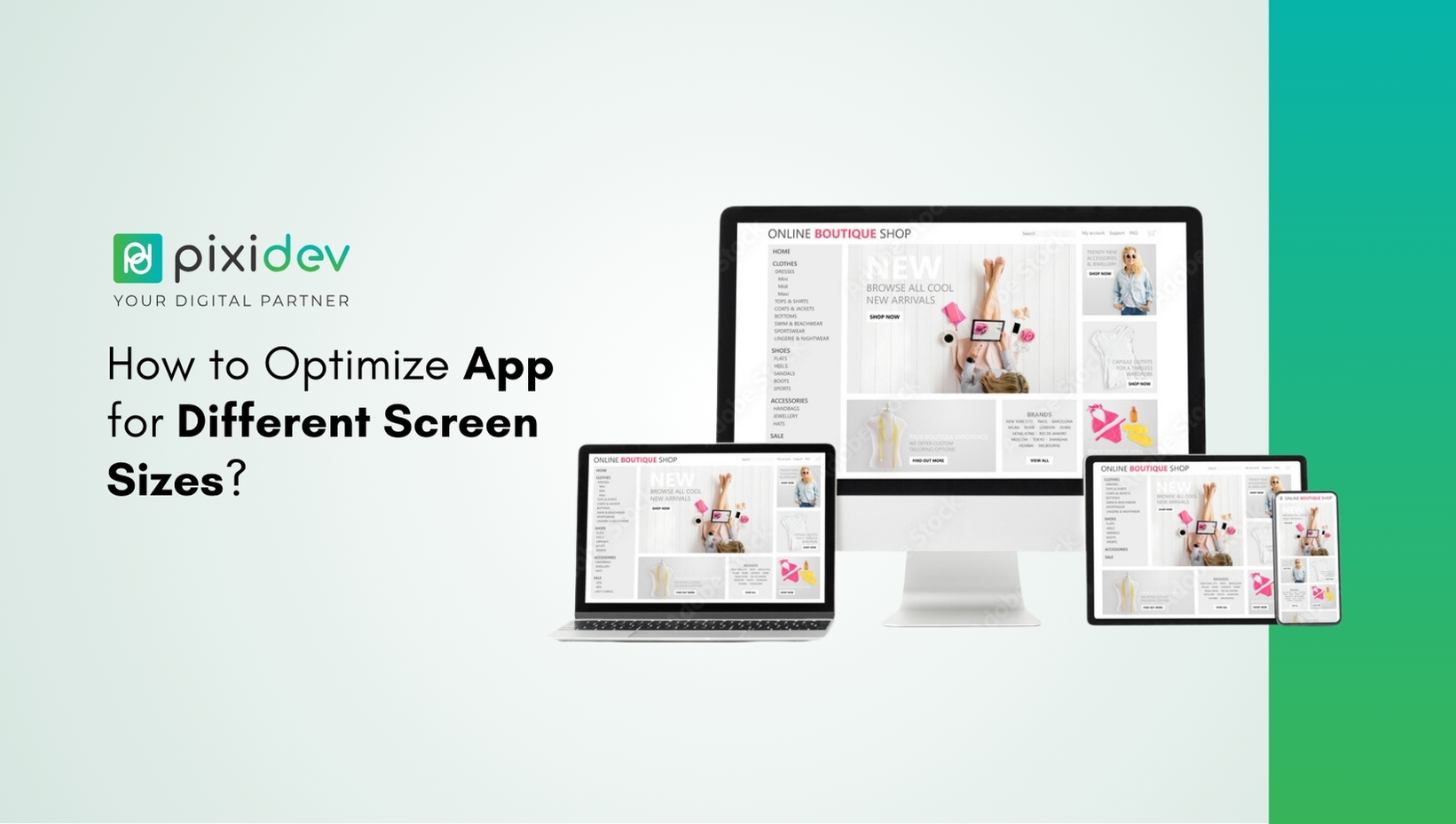
How to Optimize App for Different Screen Sizes?

Fathima Hafna

Writen by Fathima Hafna

Viewed 4 min read

How to Optimize App for Different Screen Sizes?

Understanding App Screen Size Optimization

In today’s digital world, screen size optimize App essential to ensure a smooth user experience across multiple devices. With countless smartphones, tablets, and foldable devices available, supporting various screen sizes in apps has become a top priority for developers. Whether focusing on responsive app design or adaptive layouts in mobile apps, creating a flexible UI design ensures that users get a smooth and consistent experience.

Mobile applications should be designed to accommodate different screen resolutions and aspect ratios while maintaining usability and performance. A poorly optimized app can lead to usability issues, reduced user engagement, and lower retention rates. That’s why mobile app UI scalability is crucial in modern app development.

This guide covers everything you need to know about designing for various device resolutions and ensuring your app adapts flawlessly to different screen sizes. We will explore responsive app design, adaptive layouts in mobile apps, and best practices to achieve an optimal user experience across all devices.

Let’s dive into the essential strategies for app screen size optimization and make your app adaptable for every screen.

Why is App Screen Size Optimization Important?

With the rapid evolution of mobile technology, users interact with apps on various devices with different screen sizes. Here’s why app screen size optimization is essential:

Enhanced User Experience: Apps that adjust smoothly to different screens provide a consistent and intuitive user experience.

Wider Audience Reach: Supporting multiple screen sizes in apps ensures accessibility for users across various devices.

Better Performance: Adaptive layouts in mobile apps reduce load times and prevent UI glitches.

Higher Retention Rates: A well-optimized app increases user satisfaction, leading to better engagement and retention.

Improved App Store Ranking: Google and Apple favour apps with excellent UI adaptability, enhancing visibility in search results.

By incorporating responsive app design and flexible UI design, developers can build applications that flawlessly accommodate diverse screen dimensions.

Understanding Different Screen Sizes and Resolutions

Before exploring optimization techniques, it’s crucial to understand the different screen sizes and resolutions available on the market.

Types of Screen Sizes in Mobile Devices

Small Screens (320x480px – 540x960px): Older smartphones with compact displays.

Medium Screens (720x1280px – 1080x1920px): Standard smartphones with HD resolutions.

Large Screens (1440x2560px and above): High-end devices and phablets.

Tablets and Foldable Screens: Varying aspect ratios and resolutions.

Device Resolutions and Pixel Density

Each device has different resolutions and pixel densities (PPI), affecting how elements appear on the screen. Designing an app with mobile app UI scalability ensures that layouts remain clear and visually appealing regardless of resolution.

Implementing Responsive App Design

Responsive app design is a fundamental approach that enables UI elements to adjust dynamically based on screen size. Here’s how to achieve it:

Use Relative Units Instead of Fixed Sizes

  • Avoid absolute pixel values (px) for UI components.
  • Use percentage (%), em, rem, or viewport units (vh, vw) for flexible sizing.

Flexible Grid Layouts

  • Implement CSS Grid or Flexbox for web apps.
  • Use Constraint Layout or Linear Layout in Android development.

Scalable Fonts and Icons

  • Use SP (Scale-Independent Pixels) for text to maintain readability across different screens.
  • Vector graphics and scalable icons (SVG) ensure clarity on high-resolution devices.

Breakpoints for Different Screen Sizes

  • Define breakpoints where layouts adapt to specific screen widths (e.g., mobile, tablet, desktop).
  • Implement media queries for web-based apps.

Using Adaptive Layouts in Mobile Apps

Unlike responsive app design, which dynamically adjusts, adaptive layouts in mobile apps create predefined layouts for different screen categories.

Key Techniques for Adaptive Layouts


Multiple Layout Files (Android & iOS)

  • Define different layout XML files for various screen sizes in Android.
  • Use Auto Layout in iOS for adaptive UI design.

Constraint-Based UI Design

  • Implement Constraint Layout for fluid positioning.
  • Use constraints to align elements relative to other UI components.

Dynamic UI Components

  • Adjust component positioning using relative constraints rather than fixed values.
  • Hide/show UI elements dynamically based on screen width.

Supporting Multiple Screen Sizes in Apps

Implement strategies that support different screen configurations to ensure your app is accessible across multiple devices.

Techniques to Support Multiple Screen Sizes

  • Use Density-Independent Pixels to maintain consistency across devices.
  • Create scalable UI elements using percentage-based dimensions.
  • Leverage Android’s resource qualifiers to define alternative layouts.
  • Implement viewport-based scaling in web apps.

Developers can create a unified user experience (UX) by combining adaptive layouts in mobile apps and mobile app UI scalability.

Designing for Various Device Resolutions

Different devices come with unique resolutions and aspect ratios. Here’s how to accommodate them:

Aspect Ratio Considerations

  • Optimize layouts for 16:9, 18:9, and 20:9 aspect ratios.
  • Implement flexible containers that adjust to screen ratios dynamically.

Resolution-Based Image Scaling

  • Use vector graphics instead of bitmap images.
  • Provide multiple image assets for Android devices.

Best Practices for Flexible UI Design in Apps

To ensure app screen size optimization, follow these best practices:

  • Prioritize user testing across various devices.
  • Utilize adaptive and responsive design principles together.
  • Leverage frameworks like Flutter and React Native for cross-platform compatibility.
  • Use scalable UI elements that adjust to screen sizes dynamically.

Final Thoughts on Screen Size Optimize App

Optimizing your app for different screen sizes is crucial in delivering a unified and engaging user experience. By incorporating responsive app design, adaptive layouts in mobile apps, and ensuring mobile app UI scalability, you can make your application versatile and user-friendly across various devices. A well-optimized app enhances usability, improves retention rates, boosts performance, and increases accessibility.

By following best practices such as designing for various device resolutions, using flexible UI design for apps, and conducting thorough testing, you can ensure your app adapts flawlessly to different screens. Investing in app screen size optimization leads to higher user satisfaction and long-term success in the competitive mobile market.
Related Article

Unlocking the Magic of Digital Marketing with PixidevUnlocking the Magic of Digital Marketing with Pixidev

Design . Aug 05, 2026

Unlocking the Magic of Digital Marketing with Pixidev

Read More
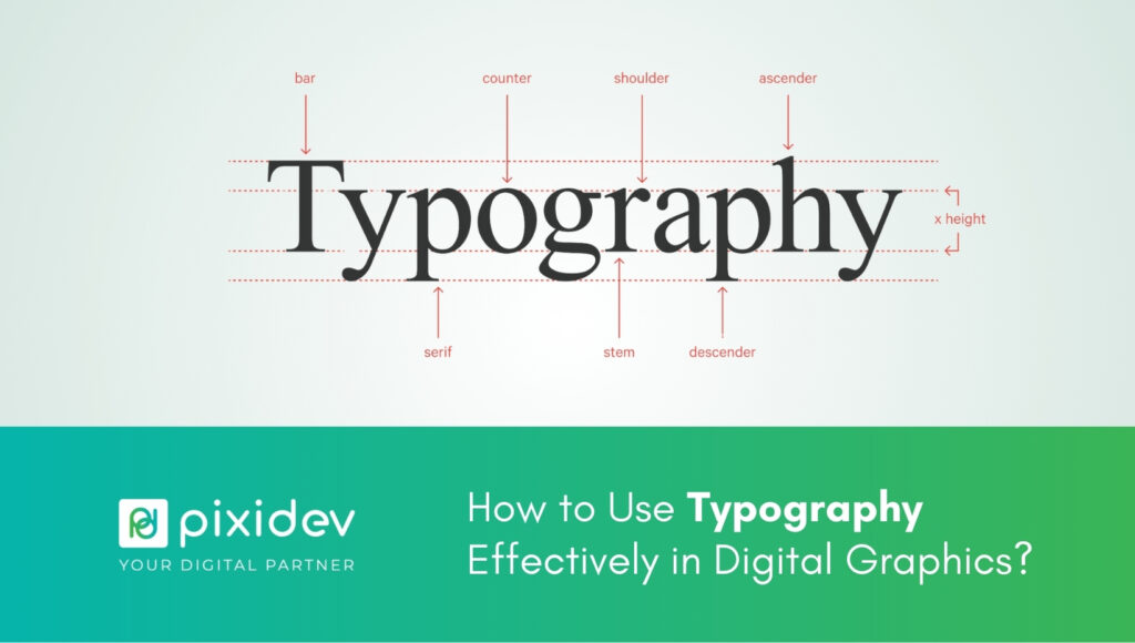
How to Use Typography Effectively in Digital Graphics?How to Use Typography Effectively in Digital Graphics?

Design . Aug 04, 2026

How to Use Typography Effectively in Digital Graphics?

Read More
15 Things Every Real Estate Website Should Have15 Things Every Real Estate Website Should Have

Real Estate . Jul 01, 2026

15 Things Every Real Estate Website Should Have

Read More
Pixidev digital agency modern office background
pixidev

We are an all-in-one creative digital agency, simplifying digital complexities and empowering brands all over the world.

Information

  • About Company
  • Porfolio
  • Services
  • Blog
  • Contact

Contact Us

  • HQ: #M01A, Saleh Bin Lahej Building, Al Garhoud, Dubai, UAE
  • BD: 12/23 Razia Sultana Road, Mohamadpur, Dhaka, Bangladesh
  • +971 50 952 4733
  • contact@pixidev.com

Have a project in your mind?

Contact Us

08 : 00 AM - 5 : 00 PM

Monday - Friday

© 2022 - 2026 | Alrights reserved by Pixidev · Privacy Policy