

Aug 04, 2026

Writen by Pixidev
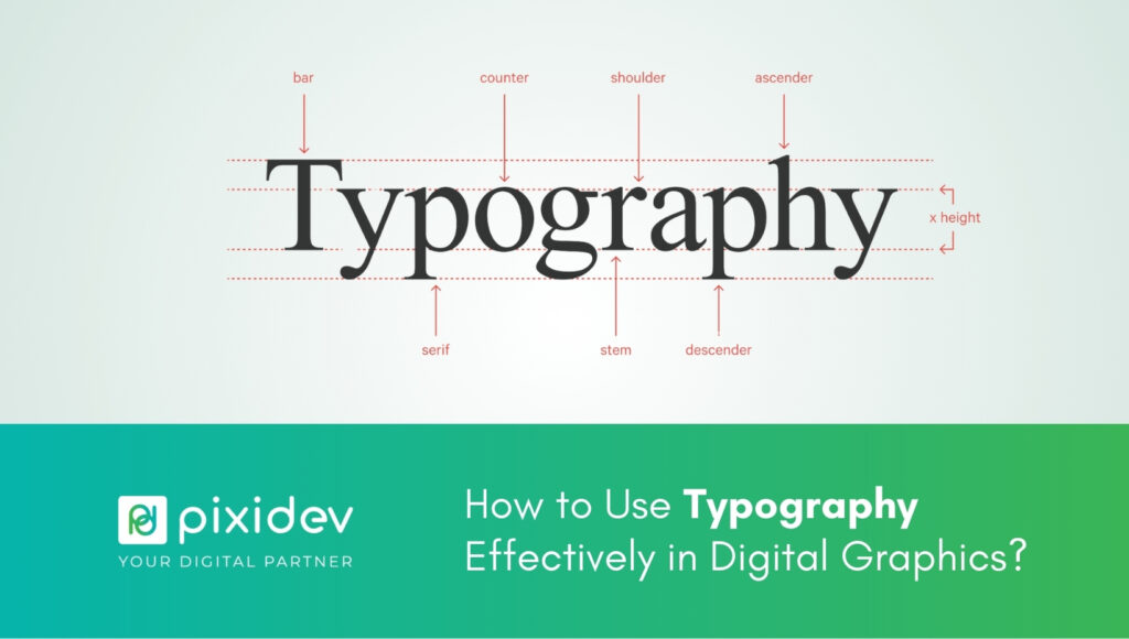
Typography is more than just arranging letters on a screen; it's an art form that shapes how your audience interacts with your design. When done right, effective typography in design elevates your message, enhances user experience, and reinforces your brand identity.
This guide explores how to master typography in graphic design by sharing typography tips for digital graphics, advice on font selection for digital graphics, and typography best practices for the web. Let's unlock the secrets of impactful typography together.
Typography is everywhere: websites, ads, apps, and social media. Its influence goes beyond aesthetics; it communicates ideas, builds trust, and drives engagement. With effective typography in design, you can amplify your message and stand out in a crowded digital landscape.
Creates Visual Hierarchy: Good typography directs attention to the most critical parts of your message.
Enhances Legibility: Clear fonts ensure your audience doesn't miss a word.
Reflects Brand Personality: Fonts convey emotion and style, helping to define your brand's identity.
Enhance User Engagement: Well-structured text keeps users engaged longer.
This blog will equip you with actionable typography tips for digital graphics and practical strategies for designing with typography. Let's get started!
Typography is more than font selection; it combines text elements to create a harmonious and impactful design. Let's break down its key components:
Typeface: Refers to the design of a set of characters (e.g., Arial, Times New Roman).
Font: Refers to a specific style and size within a typeface (e.g., Arial Bold, 12 pt).
Fonts come in weights (light, regular, bold) and styles (italic, oblique). Using different weights strategically helps establish a hierarchy.
Left, center, correct, or justified text alignment can significantly affect readability and aesthetics.
Typography in digital design requires careful consideration. Here are some tried-and-tested typography tips for digital graphics:
Stick to two or three fonts per design. Too many fonts can make your design look cluttered.
Choose fonts that are easy to read and align with your brand's tone.
Use larger, bolder fonts for headlines.
Subheadings should be smaller but distinct.
Body text should be consistent and legible.
Use colors and weights that contrast with the background to make your text pop. Light text on dark backgrounds (and vice versa) works well.
Always preview your designs on different screen sizes to ensure readability and consistency.
The right font can elevate your design, while the wrong one can distract your audience. Here's how to make intelligent font selection for digital graphics:
Modern brands: Opt for sans-serif fonts like Helvetica or Futura.
Traditional brands: Choose serif fonts like Garamond or Georgia.
Creative brands: Experiment with decorative or script fonts, but use them sparingly.
Choose fonts that resonate with your target audience. For instance, a tech audience might prefer sleek, minimal fonts, while a playful audience might respond to whimsical styles.
Avoid overly decorative fonts for body text.
Use appropriate line height (1.4 to 1.6 times font size) for better readability.
When designing for the web, typography best practices focus on usability and responsiveness. Here are some rules to follow:
Web-safe fonts like Arial, Verdana, and Tahoma ensure your text displays consistently across all browsers and devices.
Implement scalable units like em or rem in your CSS to ensure fonts resize proportionally on different screen sizes.
The ideal line length for body text is 50–75 characters. Longer lines can make reading tiresome.
Ensure sufficient color contrast between text and background to meet WCAG (Web Content Accessibility Guidelines).
Designing with typography involves more than selecting a font; it's about creating balance and flow.
Break your text into digestible chunks. Use headers, bullet points, and whitespace to avoid overwhelming readers.
Kerning: Adjust the spacing between individual letters to achieve balance.
Leading: Set the correct line spacing to make the text visually pleasing.
Typography itself can act as a visual element. For example, oversized text can be used as a graphic element to create emphasis.
Typography isn't just an artistic choice; it directly impacts user behavior. Studies show that users spend more time on websites with clear and visually appealing text.
Here's how effective typography in design can help you achieve your goals:
Boost Conversions: Clear CTAs with bold, readable fonts encourage action.
Enhance Brand Recognition: Consistent typography strengthens brand identity.
Improve User Experience: Legible fonts and proper hierarchy guide users intuitively.
Mastering effective typography in design is a skill that can elevate your digital graphics from ordinary to exceptional. By following these typography tips for digital graphics, choosing the right fonts, and applying typography best practices for the web, you'll create designs that captivate and convert.
Want to take your designs to the next level? Contact Pixidev today for expert guidance in crafting visually stunning and impactful digital graphics. Let's bring your vision to life!